ALL SHADOWS OF THE RAINBOW, OR HOW THE COLOR AFFECTS THE PHOTO
 In the technical aspect, color can be complex, but in the artistic aspect, this is one of the most important parts of the image, affecting the emotions of the viewer, unlike any other element of the photo. In our article, landscape photographer Spencer Cox will introduce you to the concept of color and color combinations in the context of photography.
Warm or cold?
Warm colors are more active and emotionally charged. They just “jump” at the viewer, attracting his attention and causing interest. Warm colors are less common in the surrounding world than cold ones, so an image in which there is a small object of such a shade can stand out – you get a natural accent. This is one of the reasons why autumn photos, sunset and sunrise shots are so popular.
Cold colors, in turn, are more muted and delicate. They fade into the background, especially if some warm color appears in the same place. In general, they do not attract attention in the same way as warm colors, although this, of course, only turns in favor of the photographer. Warm colors can be suppressing, while cold colors are more likely to look soothing. Most of the nature is woven from cool shades, although sunset and sunrise can even make the blue landscape golden.
Below we talk about each of the six primary colors: red, orange, yellow, green, blue and violet, as well as a rather insidious part of the photo – about the emotions that the viewer usually associates with these shades.
Red
One of the rarest and most powerful flowers in nature is red. It is especially important for photographers. Given the historical connection between red and the emotions of passion and excitement, it is not surprising that color is so active. Red can sometimes be too intense for certain images.
In nature, these are autumn leaves, red rocks or a bright sunset. In other genres of photography, such as portrait photography, remember that any red tint in your subject will attract attention, whether it be an element of clothing or makeup. And when shooting in the wild, red objects, for example, the bright eyes of a tree frog or a bullfinch against a snow background, instantly attract the eye.
Orange
Compared to red, orange is one of the most common in nature. It is no longer just sunsets! Brown (just a darker shade of orange) appears in nature all the time and everywhere. Orange has a wide range of shades, from the dark brown color of the trees to the bright orange pumpkin. It conveys a sensation of warmth, while it is not as strong as red. However, it is also not a passive color; it attracts quite a lot of attention, especially when the corresponding object is located on a cooler background.
Yellow
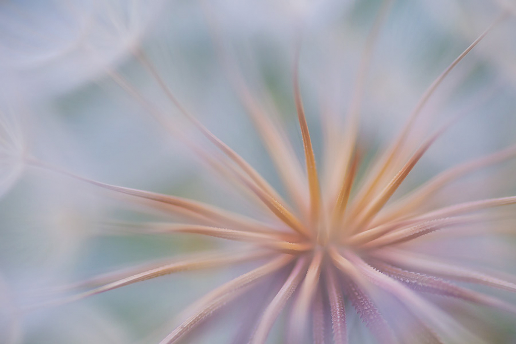
Yellow is the brightest and most optimistic color, especially when it does not appear in the picture with an admixture of orange or green. Nevertheless, it is precisely such a mixed shade of yellow that we find in the world most often. Even bright green grass and orange sunsets almost always contain a yellow component. On the other hand, sand, autumn leaves, and even the sun at certain times of the day, when they are bright yellow, work well in photographs; if your goal is to convey some positive feeling and even slight excitement.
Green
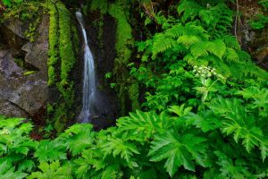
Although blue is the most common color in nature, thanks to water and sky, green is more associated with life. Our visual systems recognize more shades of green than any other color. Thus, your photos may include shades of deep green, bright green, electric green, dark green and almost endless variations. However, green is intimate and soothing, the warmest of the coldest flowers.
Blue
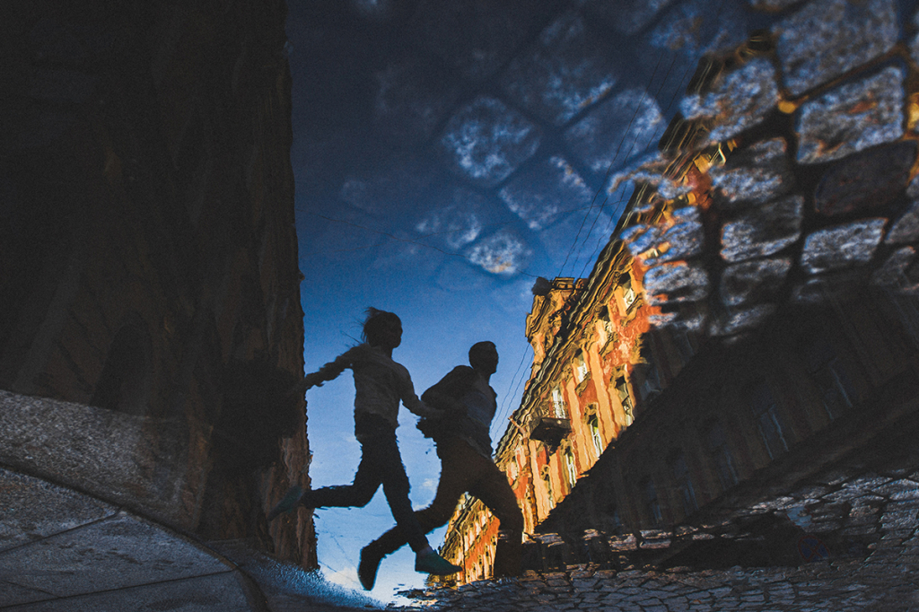
One of the first who wrote about the connection between color and emotions was Goethe in his “Theory of Flowers” of 1810, in which he said that the blue color “pulls us along.” Today’s prevailing opinion is not so different. Perhaps this is the case when the artistic tradition overtook reality, and maybe there is something to it. After all, blue is directly related to distance in the real world. A haze on the horizon, like the blue sky itself, signals distant, even inaccessible to us places.
It is a well-known fact about photography on Instagram that blue images, on average, get more likes than images with warmer colors. This is due to the fact that the saturated shades of red and orange are not well transferred to the smaller screen, and blue is not so distracting.